Introduction
In an era where environmental sustainability is of paramount importance, understanding and optimizing the use of green energy sources is crucial. To provide valuable insights into green energy production and its environmental impact, we have developed a comprehensive dashboard using a dataset that simulates green energy statistics. In this blog post, we’ll take you on a journey through the key features of our dashboard, revealing important insights into energy production, CO2 emissions, and other crucial factors.
Dashboard at a Glance
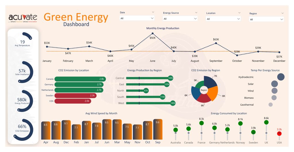
Monthly Energy Production

In our dashboard, the line chart vividly illustrates the monthly variation in energy production, showcasing both the target and actual values. This comprehensive insight is invaluable for energy planners and policymakers, as it not only highlights fluctuations in actual energy production but also compares them against established targets, enabling a deeper understanding of performance and progress towards sustainability goals.
CO2 Emission by Location
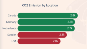
Understanding the geographic distribution of CO2 emissions is a critical component of sustainability efforts. Our bar chart breaks down CO2 emissions by location, providing a clear view of which areas are making the most significant contributions to greenhouse gas emissions.
Energy Produced by Region
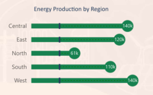
Regions play a pivotal role in green energy generation. The bar chart displays the energy produced in various regions, helping identify areas with the highest and lowest green energy output. This information can guide investments and infrastructure development.
CO2 Emission by Region
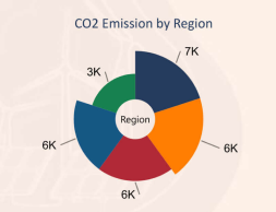
The donut chart provides a compact representation of CO2 emissions by region. It enables quick identification of regions with the highest environmental impact, highlighting areas where improvements in sustainability are needed.
Temperature per Energy Source
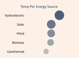
The bubble chart offers insights into the relationship between energy sources and temperature. It allows you to see how different energy sources perform in various temperature conditions. This data can guide decisions on the choice of energy source in specific climates.
Average Wind Speed by Months

Wind speed is a critical factor for wind energy production. The column chart displays the average wind speed each month, aiding in planning and forecasting energy production.
Circular Progress Bar Charts

The dashboard features circular progress bar charts that provide real-time updates on average temperature, solar irradiance, energy produced, and CO2 emissions. These circular charts offer a quick overview of key metrics in a visually appealing format.
Slicers/Filters

To make the dashboard interactive and user-friendly, we have incorporated slicers and filters. You can easily select specific dates, energy sources, locations, and regions to customize your view. This feature allows you to tailor the dashboard to your specific needs and explore data in depth.
Conclusion
Our green energy dashboard offers a comprehensive view of key environmental metrics, allowing users to make data-driven decisions and promote sustainable energy practices. By visualizing data on energy production, CO2 emissions, temperature, and more, it provides valuable insights that can guide policymakers, energy planners, and environmental advocates in their efforts to create a cleaner and more sustainable future. This tool empowers us to harness the power of green energy while minimizing our carbon footprint.
The dashboard is not only a powerful tool for understanding green energy statistics but also an example of how data visualization can drive environmental awareness and action.
We invite you to wield this power, tailor it to your narrative, and take a stand for sustainability.


